I have a confession – I have a minor obsession with logos. Perhaps it’s all the time I have spent with designers, or being married to one – but I love the meaning behind logos and the affect a small icon can have on people.
The golden arches in any country gives me a craving for chocolate milkshake, a small apple with a bite taken out of it implies luxury technology and a mulberry tree makes me want to sell my husband just to get my hands on a leather bag!
The past couple of years have seen a number of brands alter their logo and 2015 saw the Infotex logo evolve and develop (more on this from our Design Director Abi Fawcus next month). But why did these companies change their already well-known brand symbol?:
1. TO ADAPT TO A CHANGING MARKET:
This year we saw the Google logo had its biggest redesign since 1999. The change was based upon how people react to Google across “many different platforms, apps and devices.”1 The typeface of the new logo is ‘product sans’ which combines “the mathematical purity of geometric forms with the childlike simplicity of schoolbook letter printing”. The renowned four colour is seen across the brand even featuring in the microphone design when using voice controls on your mobile.


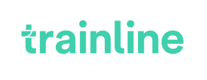
Thetrainline.com has also adapted to the mobile market by changing their name to simply Trainline. They launched a new mobile app to illustrate their new brand concept of ‘Smarter Journeys’, with the CEO Clare Gilmartin stating that their “mission is to help people travel smarter, and by using their phones they can enjoy the advantages of saving money by buying in advance and ensuring they have real time travel updates during their journey.”2 The #IAmTrain campaign was also launched to promote the change with a heavy emphasis on using social media to promote the new mobile friendly brand.

2. IN RESPONSE TO A MAJOR CHANGE IN THE COMPANY:
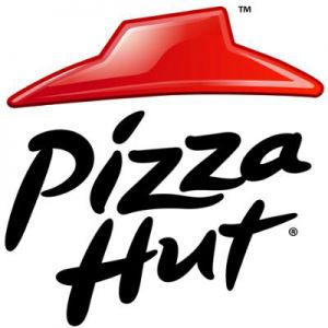
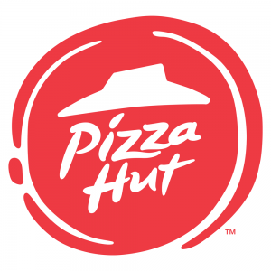
Pizzahut has recently redesigned their logo in response the their biggest menu change in years. Dubbed as the ‘Flavour of Now’ this new menu is seen as a response to their recent stagnation in the market and this logo change is used to help the transition. The Vice President of Marketing commented that “Any good flavorful pizza starts with a sauce swirl”3 which is what inspired the red swirl on the edge of the logo.
3. TO PROMOTE A NEW BRAND IDENTITY:
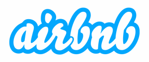
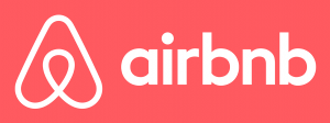
Airbnb completely changed their brand positioning in 2014 by promoting the sense that their customers can ‘belong’ in any of the properties rented through their website. They introduced their “Bélo” logo – “It’s an iconic mark for our windows, our doors, and our shared values. It’s a symbol that, like us, can belong wherever it happens to be”4
4. A BAD RESPONSE TO A LOGO DESIGN?
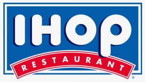
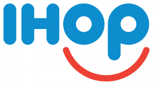
American restaurant giant IHOP (International House of Pancakes) changed their logo for the first time in decades this year. They have simplified the logo but the most major change is the red line below IHOP from a downward to an upward curve. According to the company’s Vice President of Marketing, the old logo “appeared as a person’s frown.”5 Instead he believes that the new and more positive logo will be more attractive to customers and “make them smile.”
5. FOR THE SAKE OF CHANGE?
Facebook have made very slight alterations to their logo using a custom typeface to “modernise the logo to make it feel more friendly and approachable”6 (Josh Higgins, Facebook’s creative director). The most noticeable change is the “a” which is fuller and rounder.

1 Evolving the Google Identity
2. thetrainline.com Rebrands itself to Trainline
3 Inside the Pizza Hut’s Saucy Rebranding
5 IHOP Changed its Logo, says the old one looked like a frown
6. Facebook unveils new logo in stunning change for fans of the letter A